Center for Independence (CFI)

The mission of CFI is to help children and young adults with disabilities achieve their highest level of independence in the home, school, community and ultimately employment. The nonprofit organization offers therapy programs that develop life skills and motor function in a manner that promotes positive self-direction, self-esteem and an “I Can!” attitude.

Project Overview

Aligning strategy with the mission

The requirements for the site was to be responsive (desktop to mobile) featuring rich, succinct accessible content. We delivered on these goals and provided a clear path for the user while conveying the CFI's mission

Mapping it Out
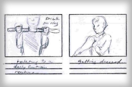
Storyboard detail for CFI's video presentations
Storyboard sketches for videos.
UX Research & Information Architecture

We began by reviewing the old site's content and stats. Info and ideas were collected from CFI's physical therapists and parents. Many iterations of the content were revised and distilled delivering strategic insights and influencing the short- and long-term website strategy.
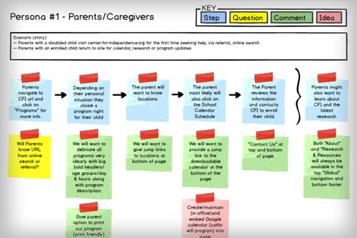
CFI persona journey mapping study example
Journey mapping study using Balsamiq.
Journey Maps & User Case Studies

Exploring the psychology and motives of CFI's three primary users, case studies were assembled with the goal of building empathy and trust.
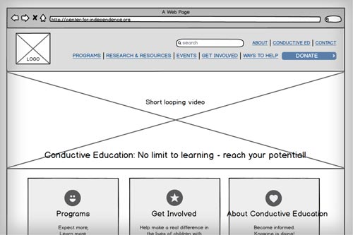
 

CFI website wireframe detail
Wireframe example using Balsamiq.
Sitemaps & Wireframes

Sitemaps and wireframes, were created to be reviewed in conjunction with the Information Architecture document to best identify required information and pain points. Many iterations were used to determine content that best represented the users' needs' and the organization's logic internal editorial practices.

Emerging Landscapes

visual design & Communication

User experience and the design's, look and feel were carefully examined in conjunction with the Center’s brand and visual library. Moodboards were created incorporating color scheme, photos, iconography and typography pairings presented to illustrate site design ideas.

Primary Colors

CFI Blue

UI Black

Secondary Colors

Call Out Green

CTA Button Blue

Accent Red

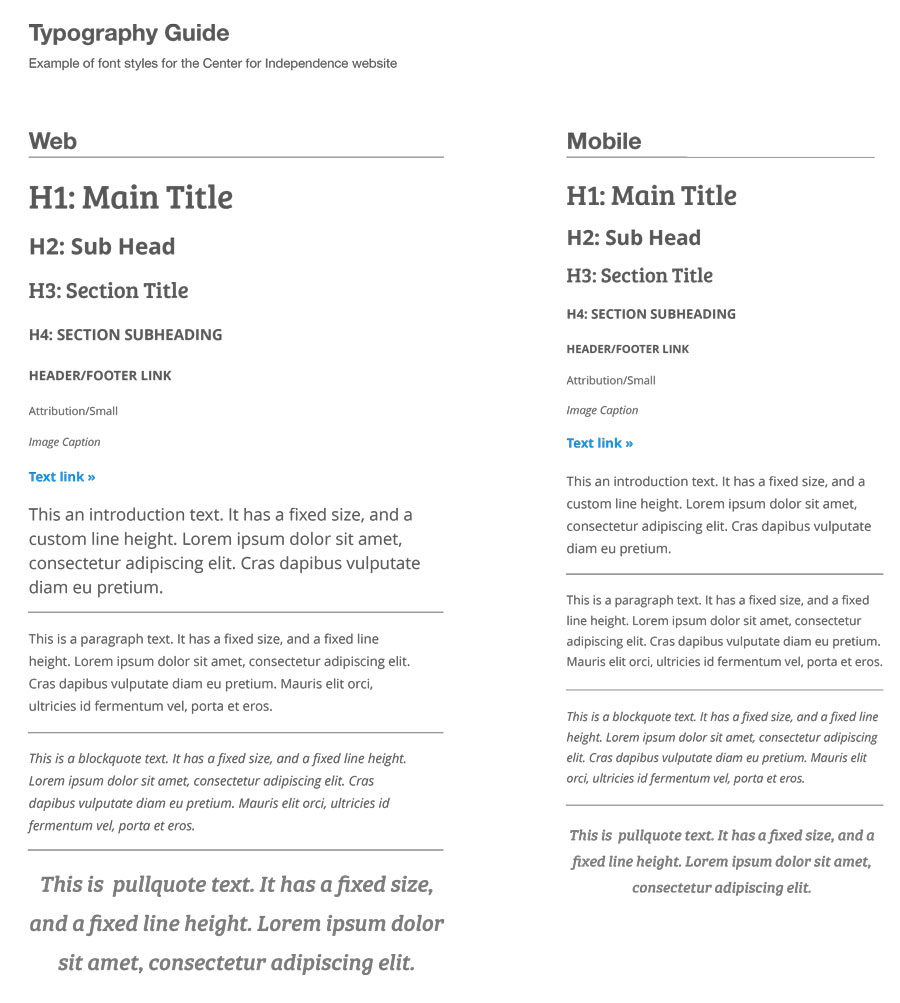
Typography

To evoke a feeling of hope and playfulness, Bree Serif was chosen for the headers and the modern, legible Open Sans for the sub-header and body copy.

Program used: Sketch.

Typography-cfi

Icons

To set the site apart visually, a custom icon set was designed.

Vector illustrations created in Adobe Illustrator.

CFI custom icon set

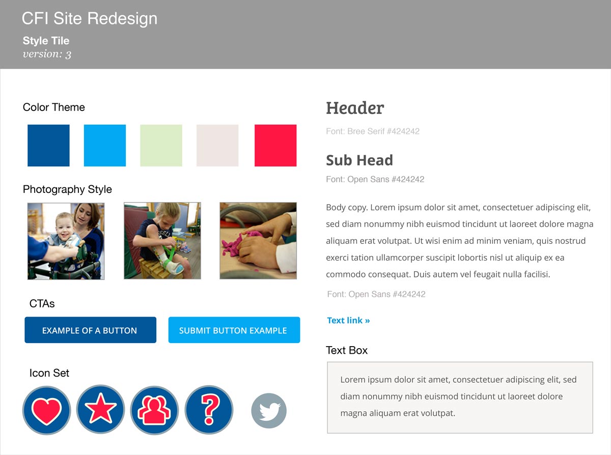
Style guide

Using CFI's brand guidelines, design elements created for the new site were compiled into "style tile" to illustrate basic visual concepts.

Program used: Sketch.

CFI style tile example

The Finish Line

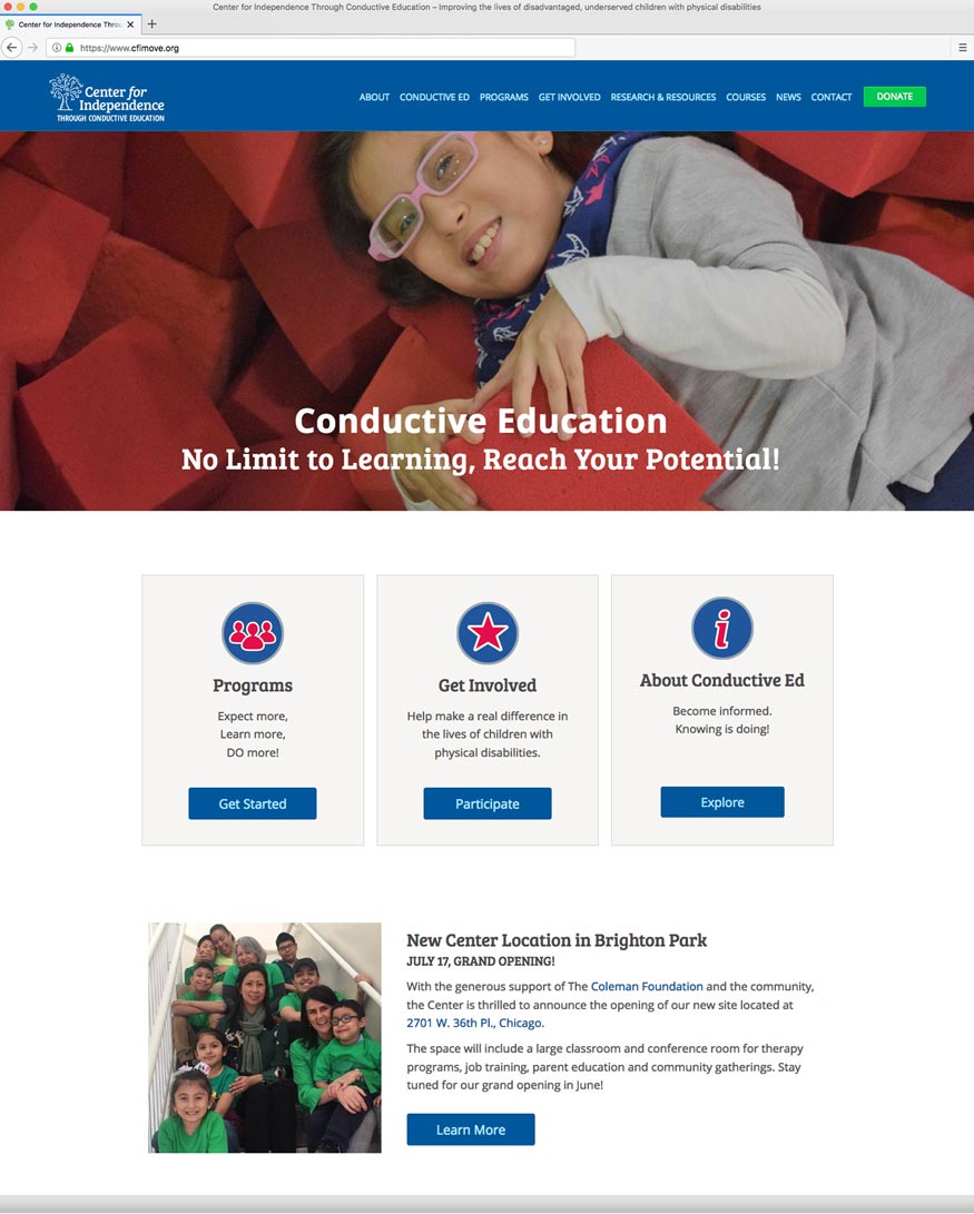
Rapid Prototyping & Launch

Incorporating agile methodology, site pages are created in WordPress and shared with the CFI team. A high-fidelity prototype emerges through weekly design reviews; designs are tested and revised. The final approval for the new site to change over and go live is given before taking the old site offline.
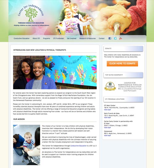
CFI's old home page.
CFI's old home page (2010-2017)