LOGO DEVELOPEMENT
NU*U Melanin Enriche
Launched in 2020, this Chicago company's focus features products made with natural ingredients that keep skin healthy and aid irritated skin with products from the earth.
At our recommendation, client created a mood board to help us understand their marketing vision.
Initially the client requested that an astrix be used between the two letters u as seen in the first concept (shown right). After some discussion with the client about exploring a more organic approach, we settled on a palm leaf.
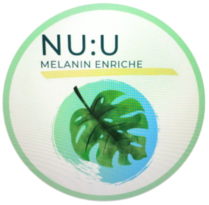
The image on the left was provided by the client with an idea in mind, which was then used as a starting point to produce the company's identity.

LOGO DEVELOPEMENT
Center for Independence (CFI)
In 1998, Patti and her husband, Chuck Herbst, founded the Center for Independence starting in a church basement serving 6 children, including their young son.
Like many logos, at the beginning of a venture an identity is often quickly thrown together without professional consultation.
![]()
Therefore, the original logo, on the left, was basically comprised of a "clip-art" tree and a PC system font. As the organization grew, a need to rework and refine the logo became apparent.
Although many iterations were provided to the client, in an attempt to replace the "clip-art" tree, the staff found that they were quite fond of the image and wanted to keep it. With this in mind we moved forward by replacing the type-style with modern fonts, brightened the color pallette, and improved the lockup. A style guide document was also created to provide clear guidelines to the CFI Team on how to communicate the brand effectively.
Check out CFI's Style Guide